In May 2015 3 fox cubs were born under my studio- today 2 returned for a visit!

Roomscaping
find out more
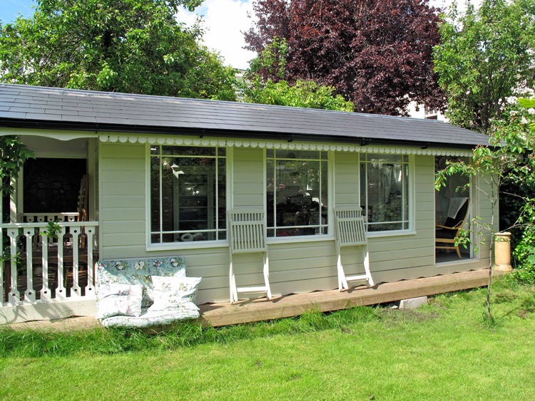
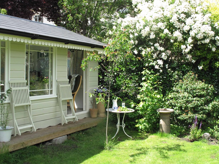
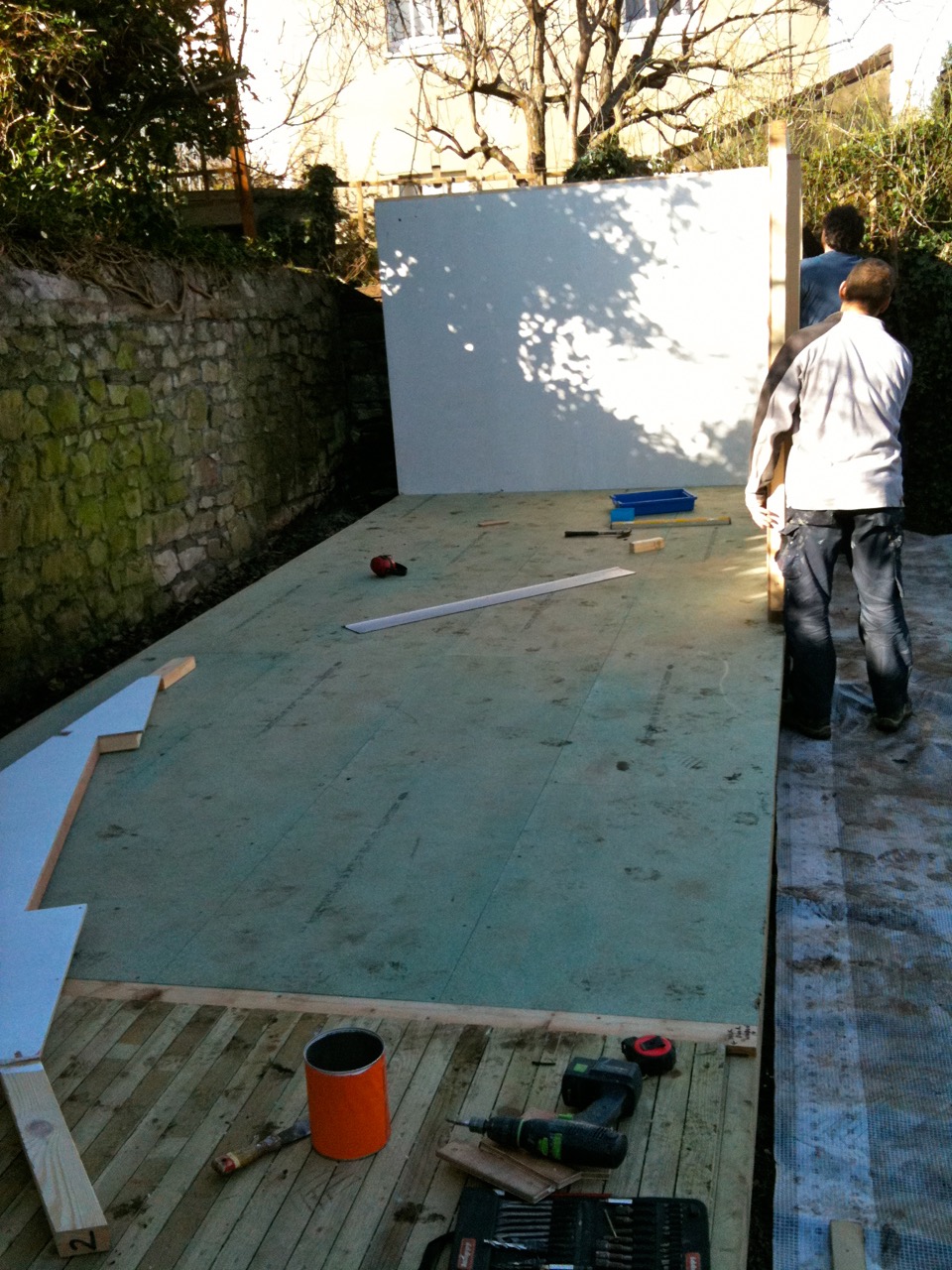
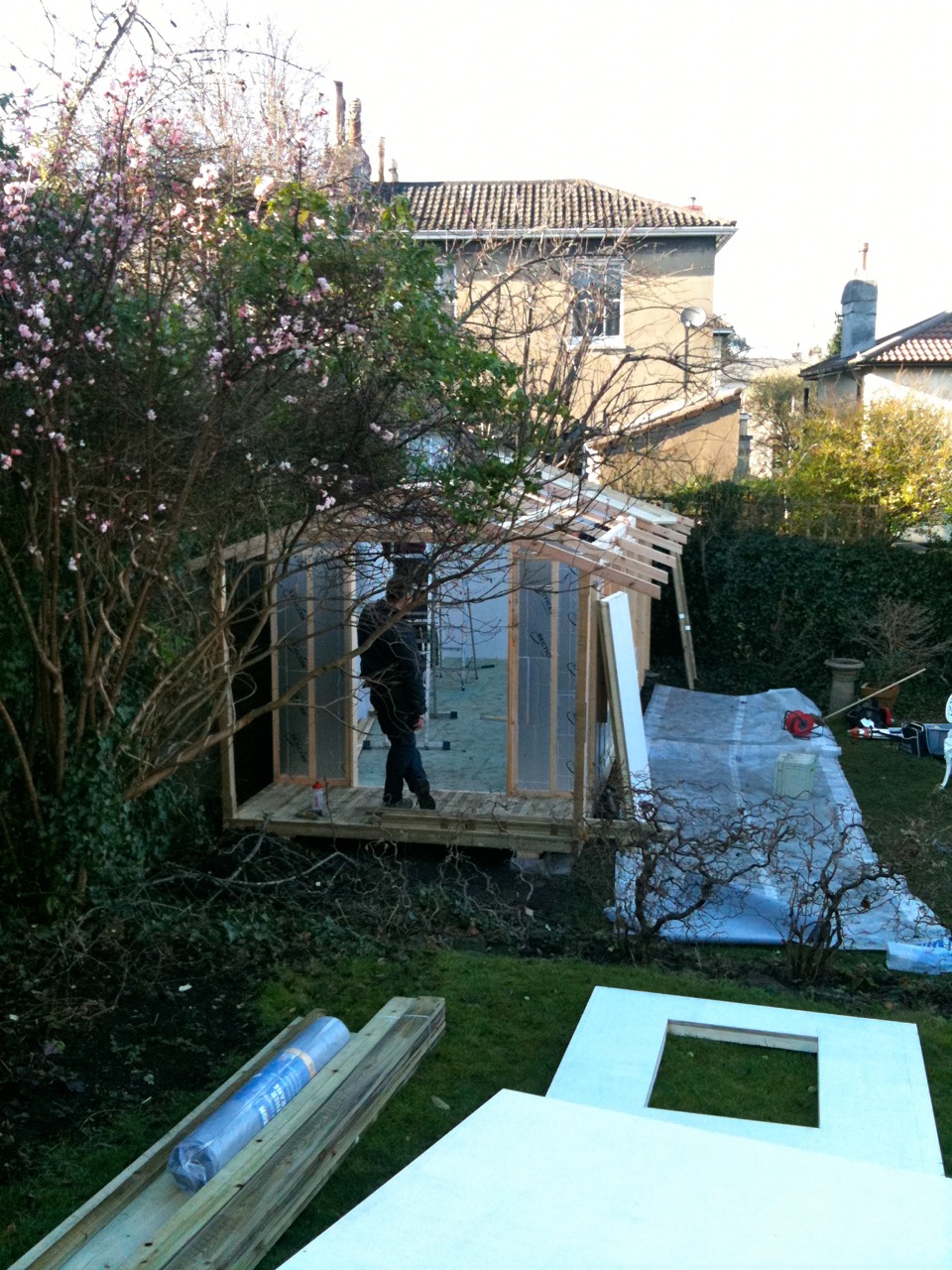
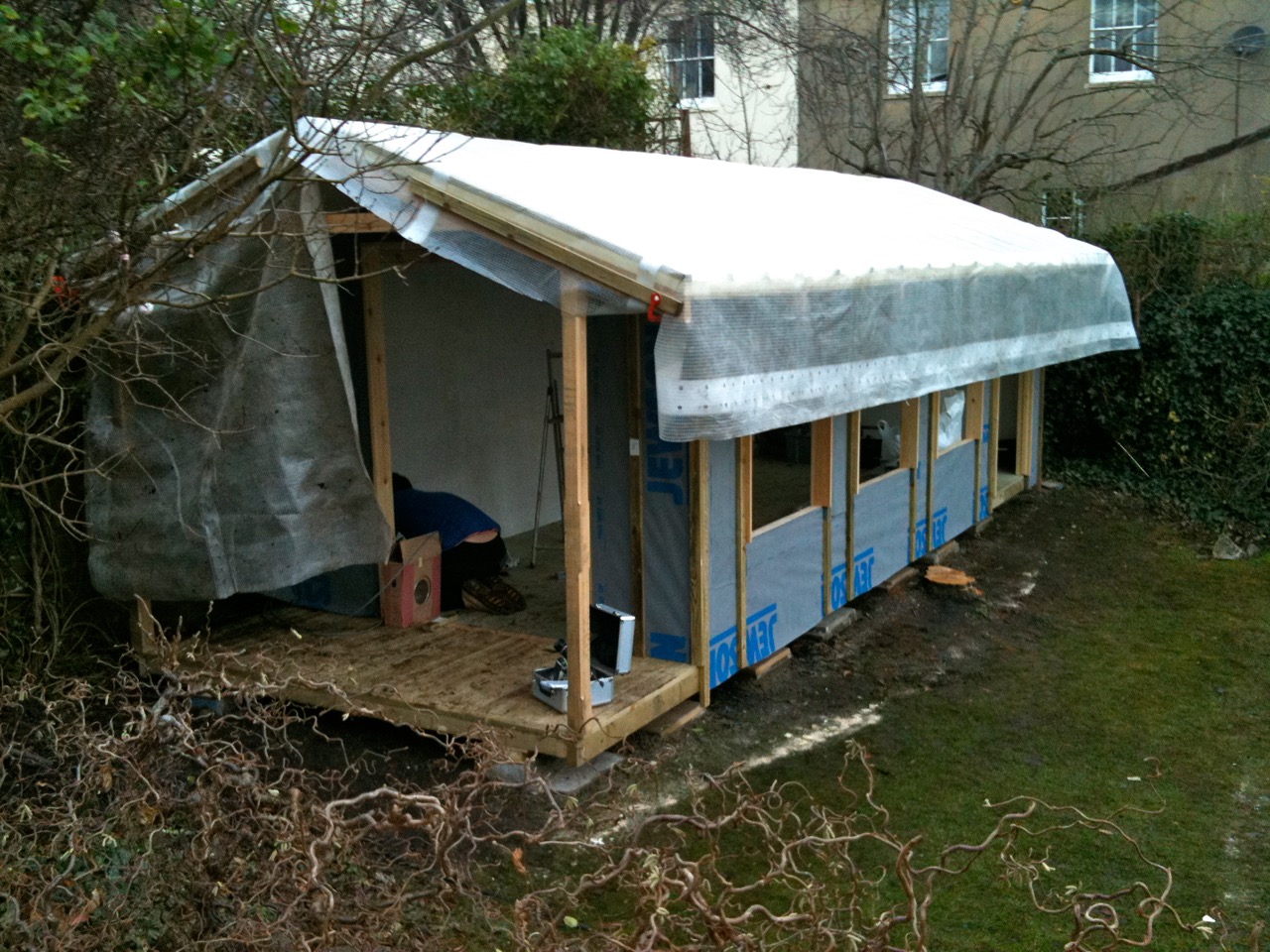
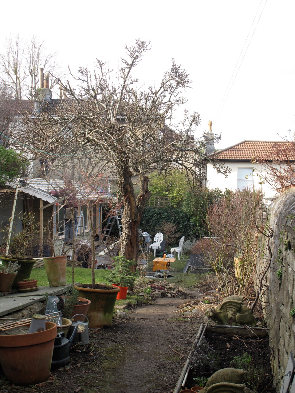
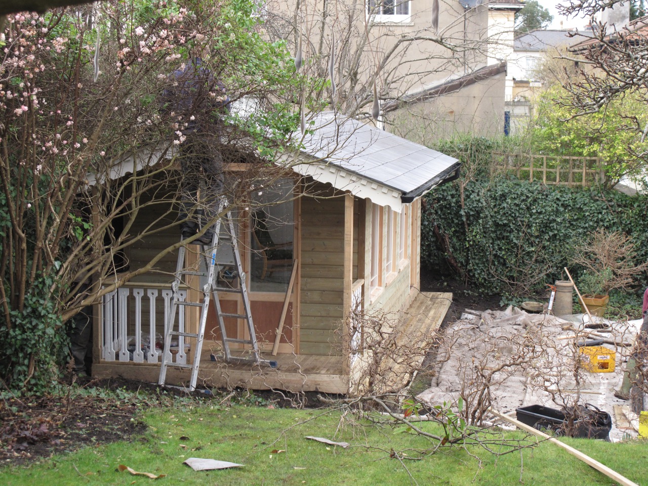
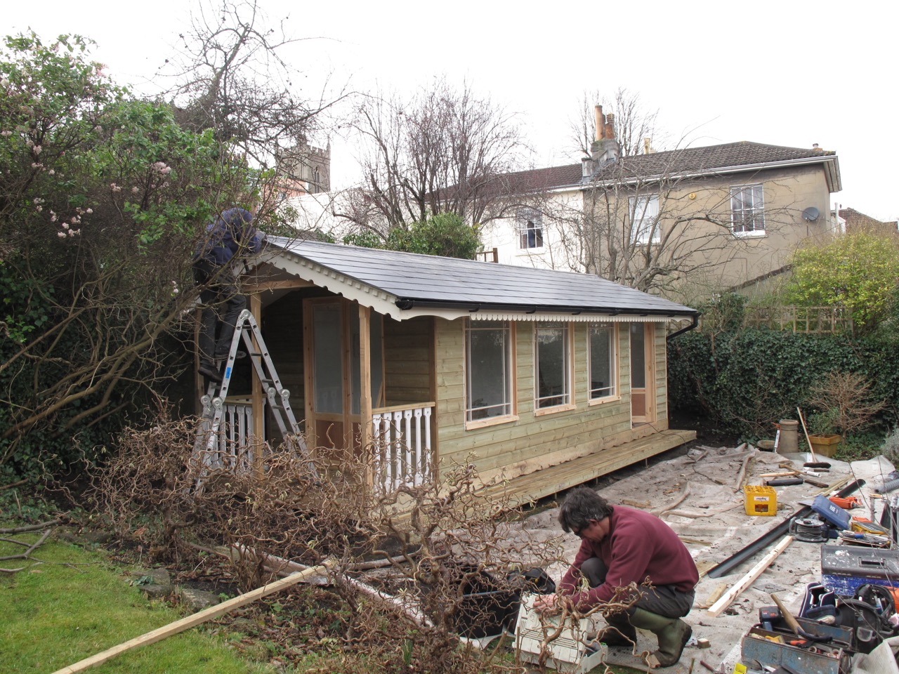
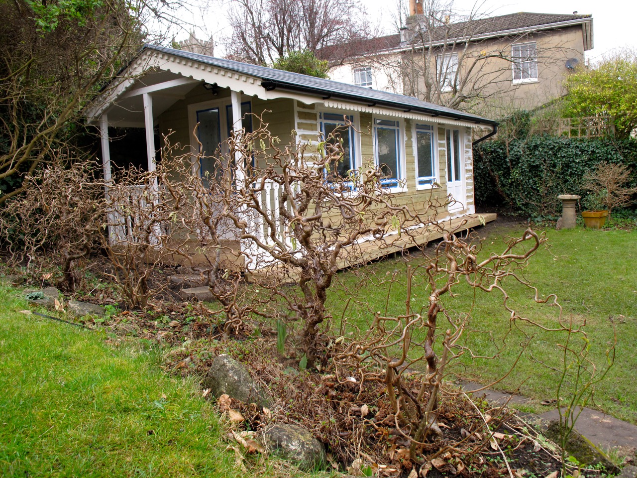
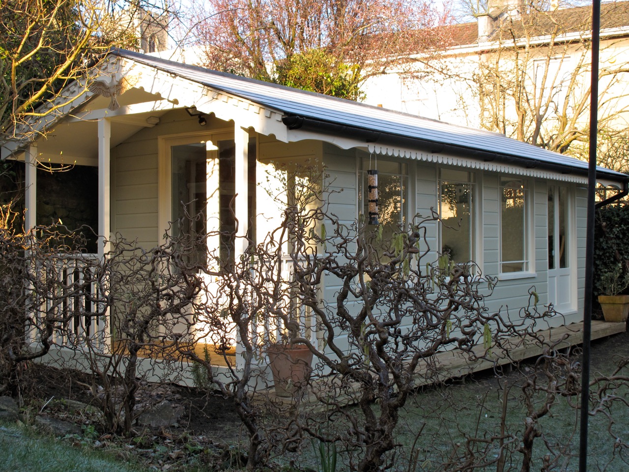
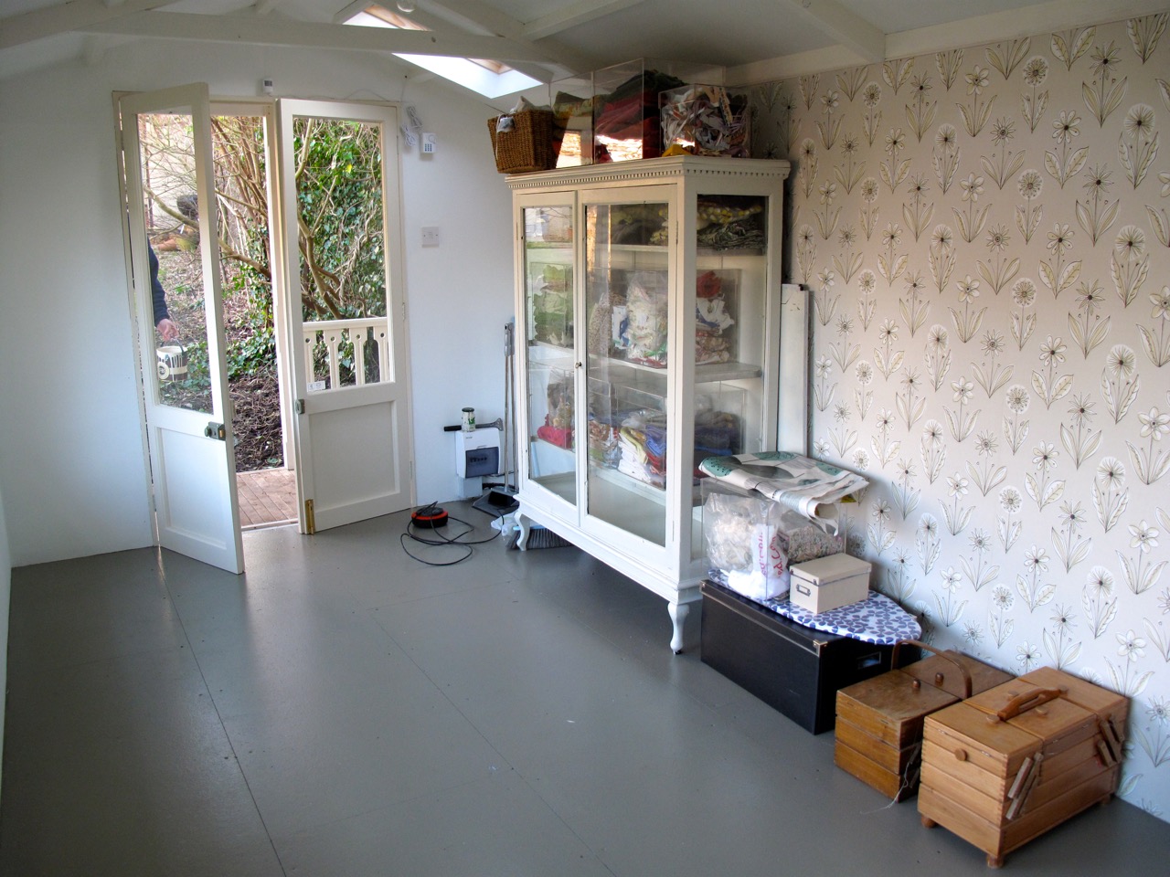
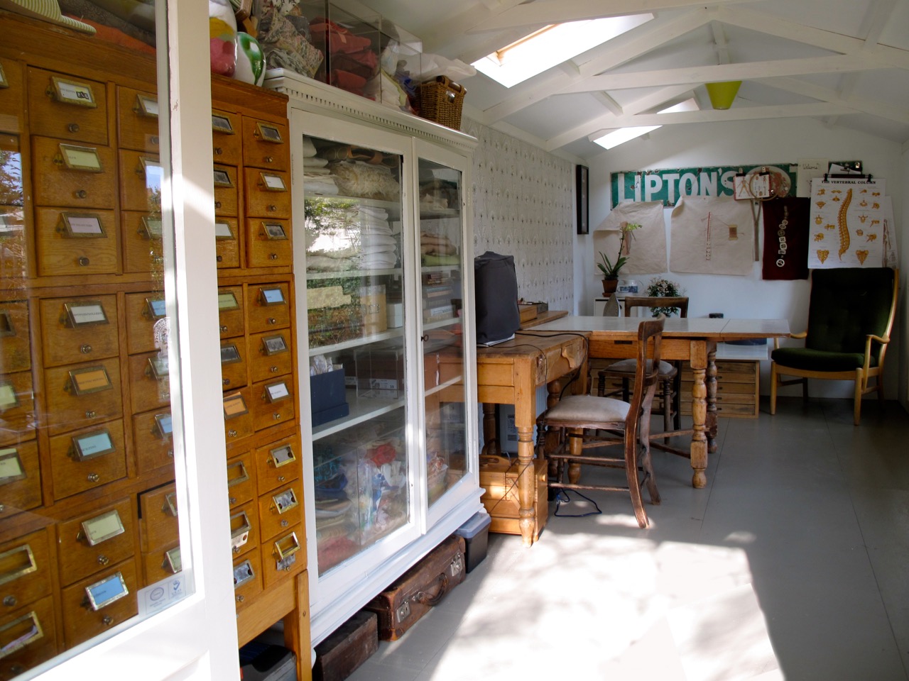
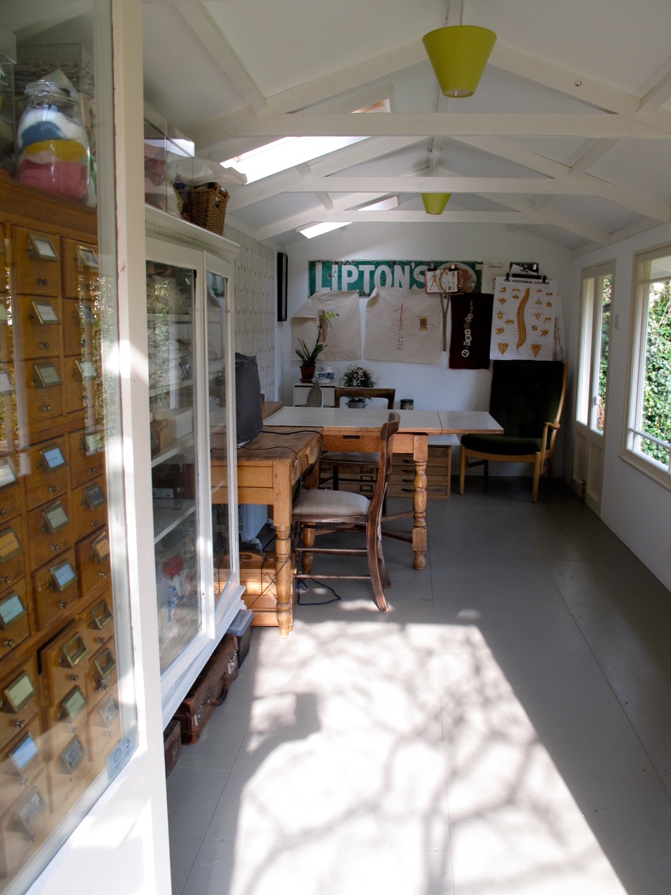
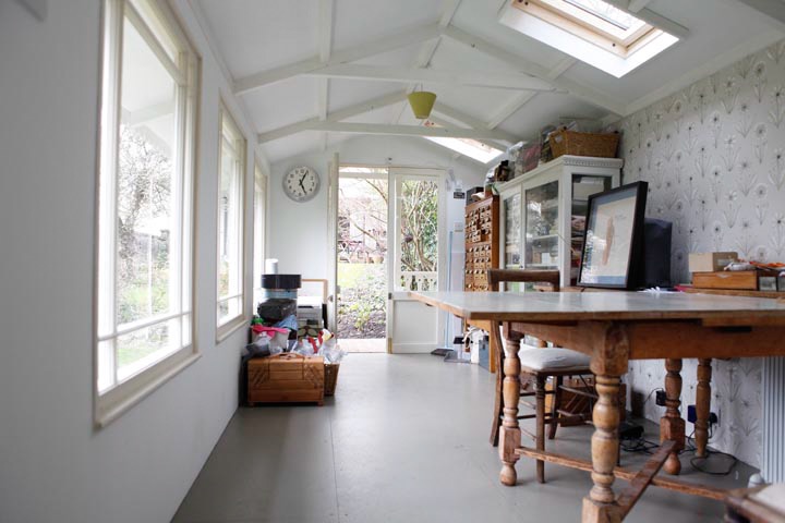
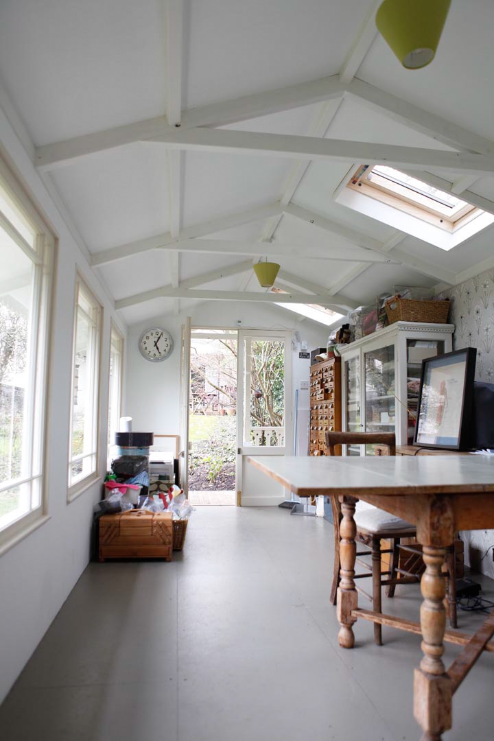
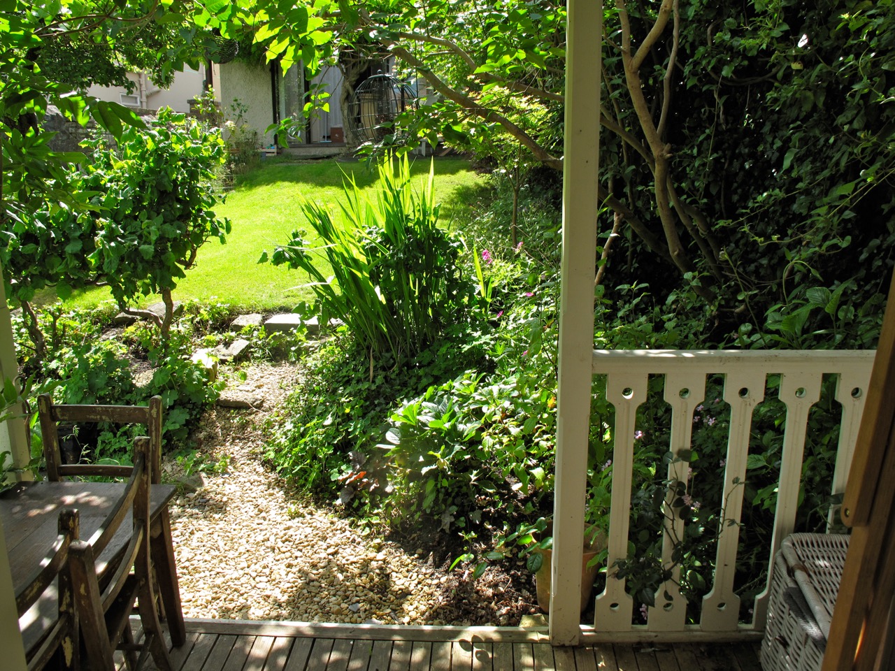
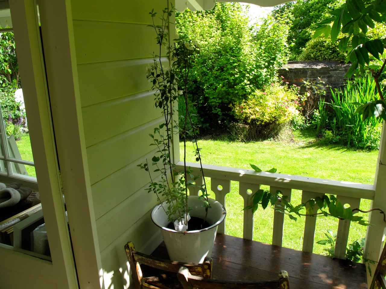
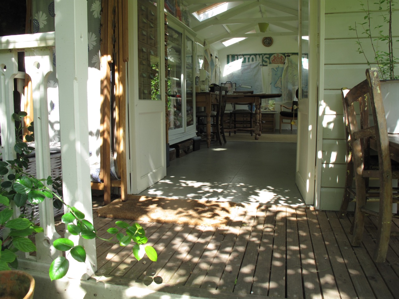
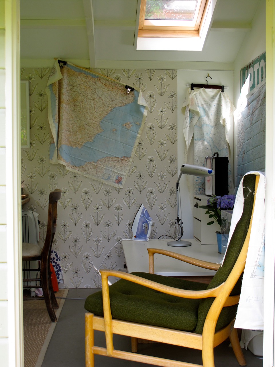
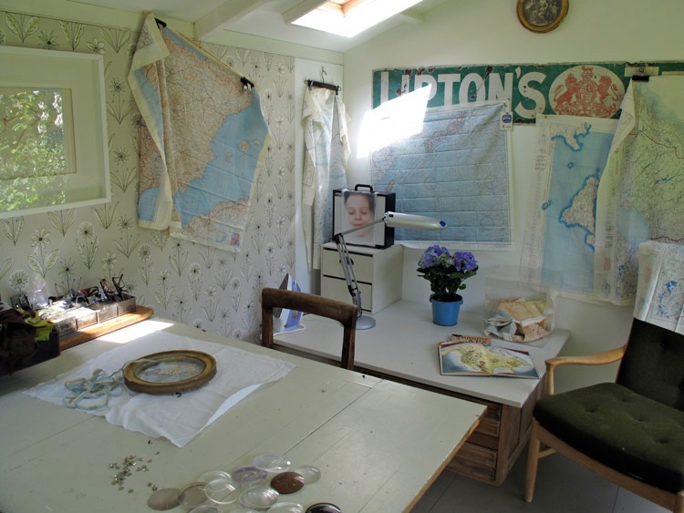
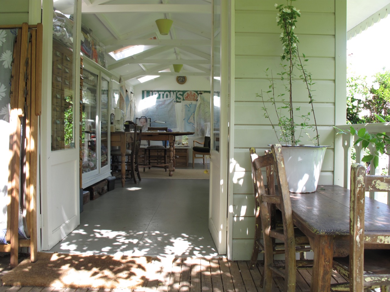
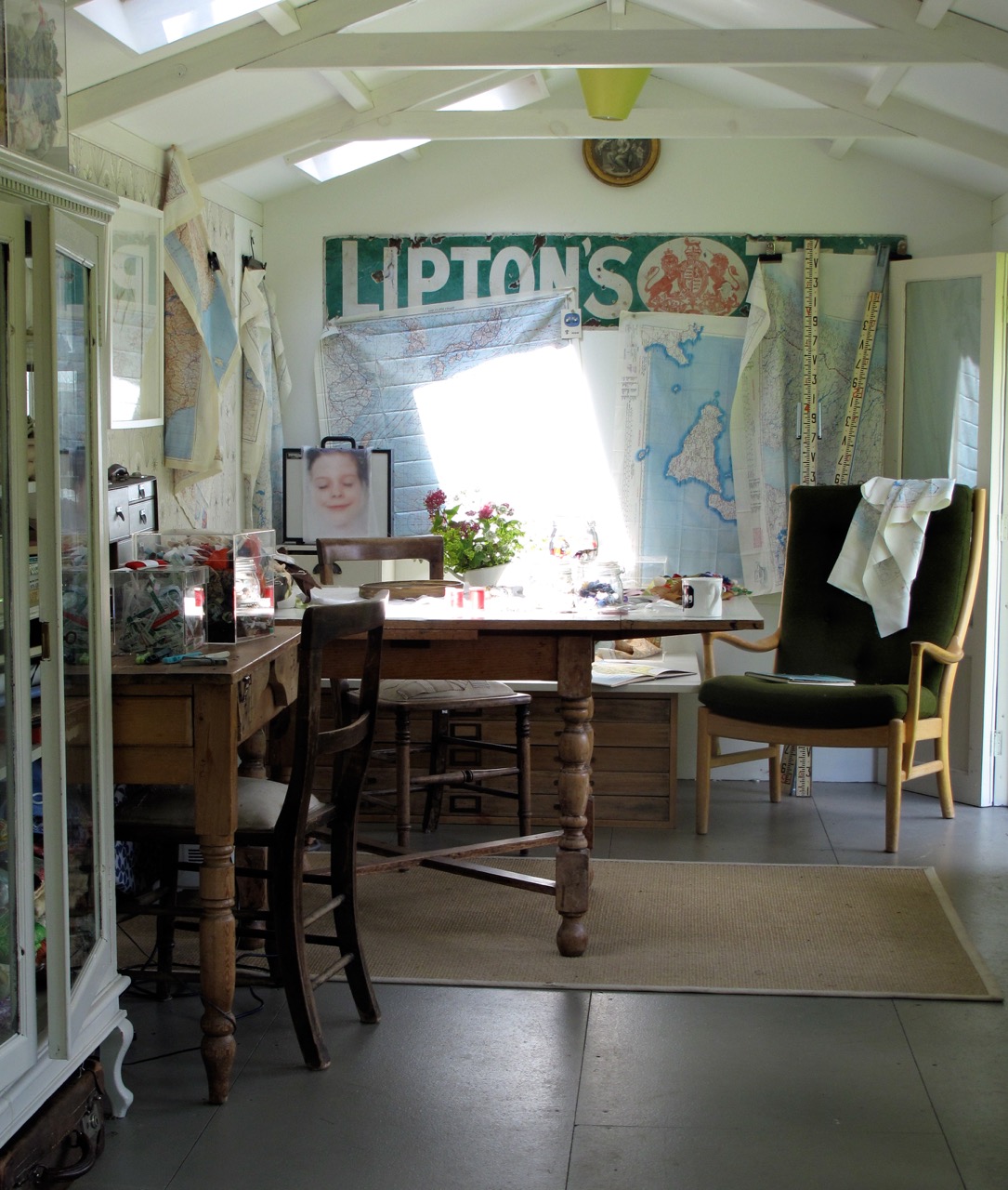
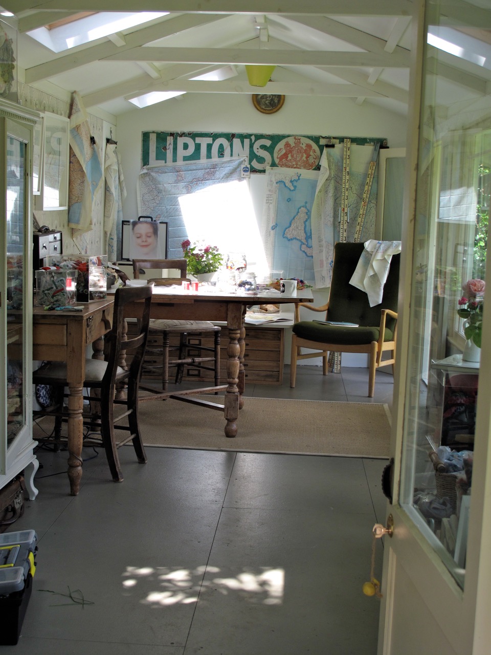
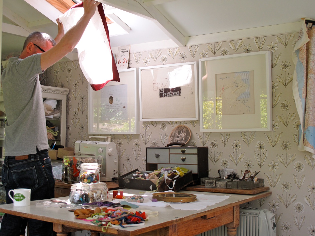
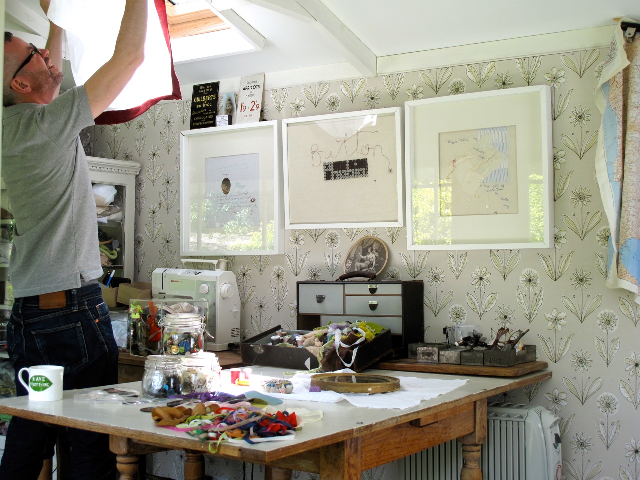
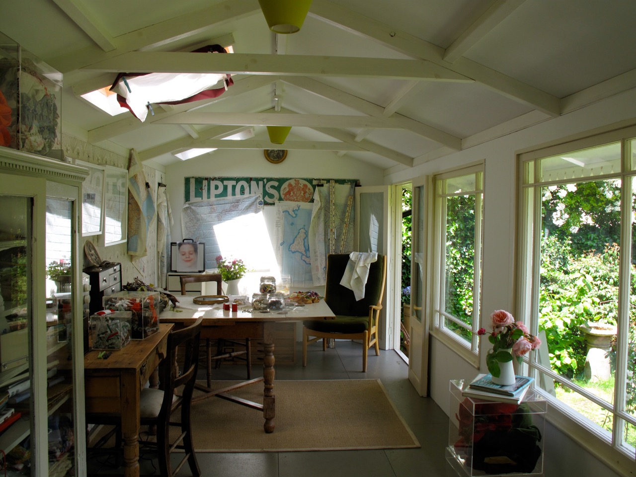
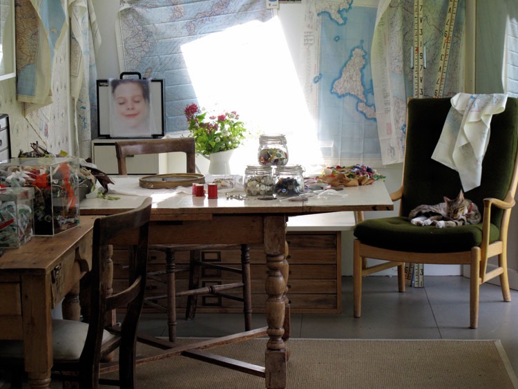
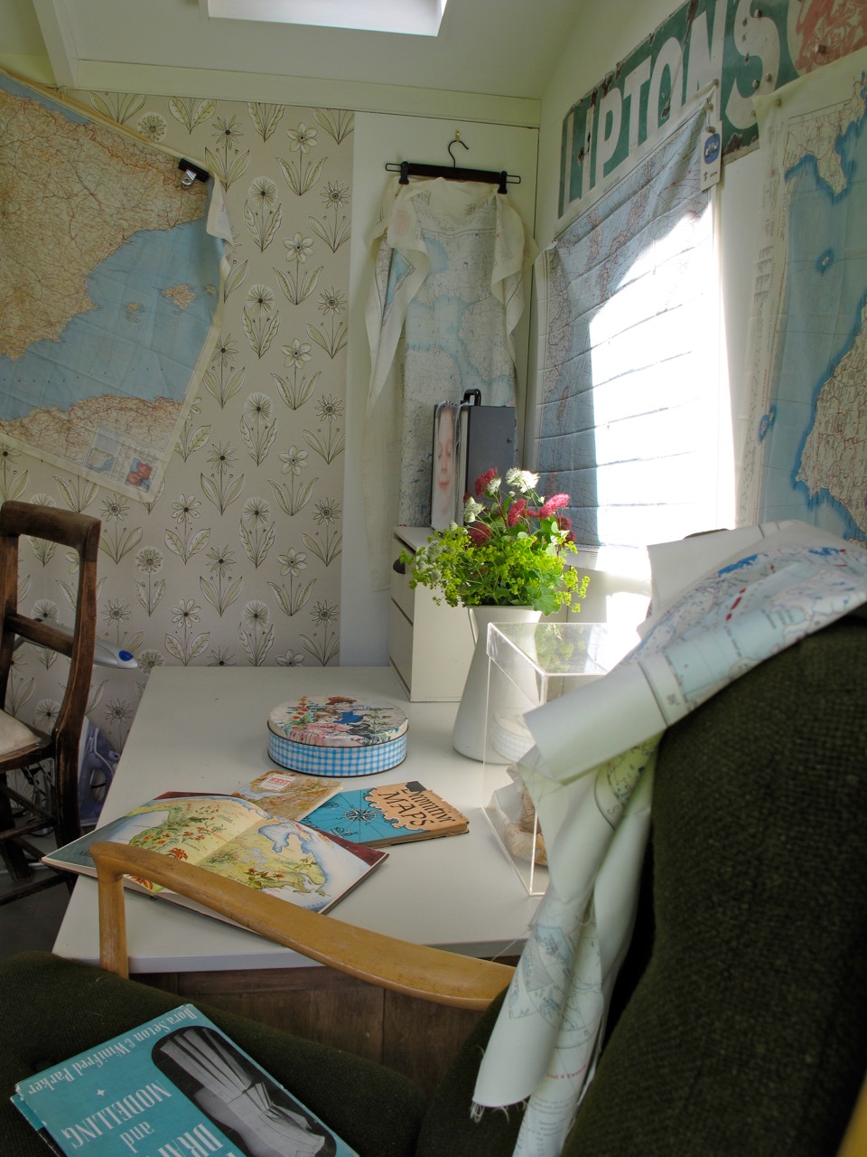
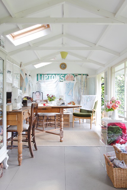
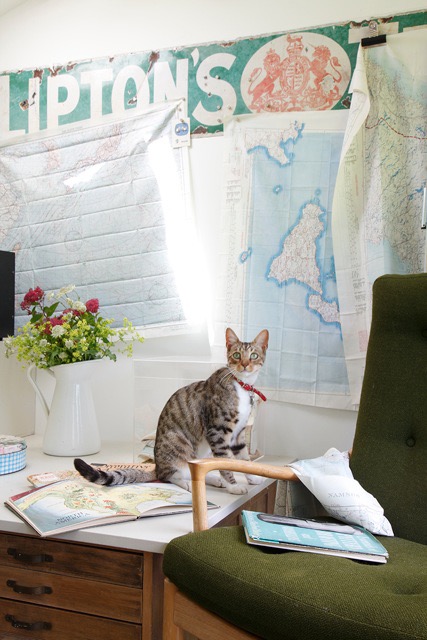
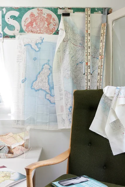
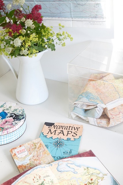
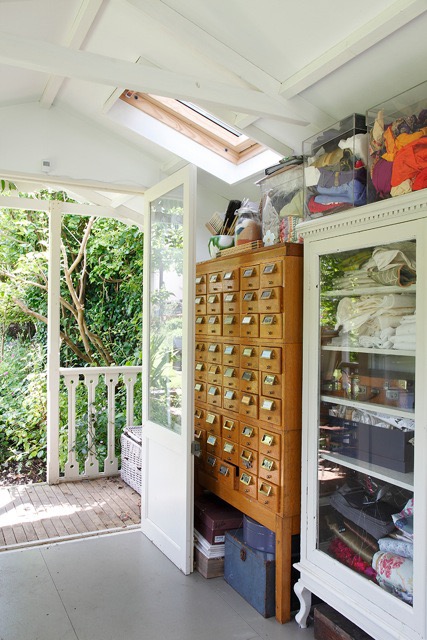
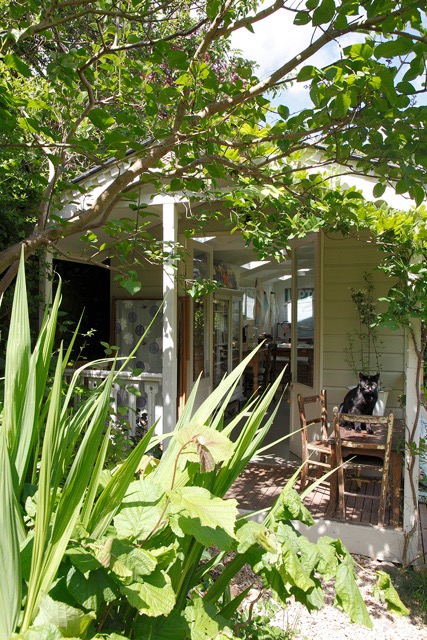
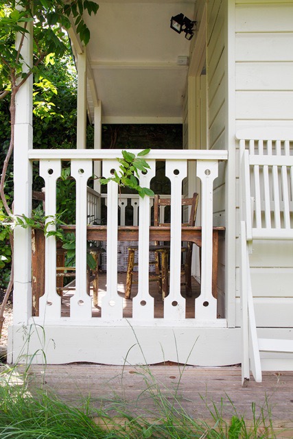
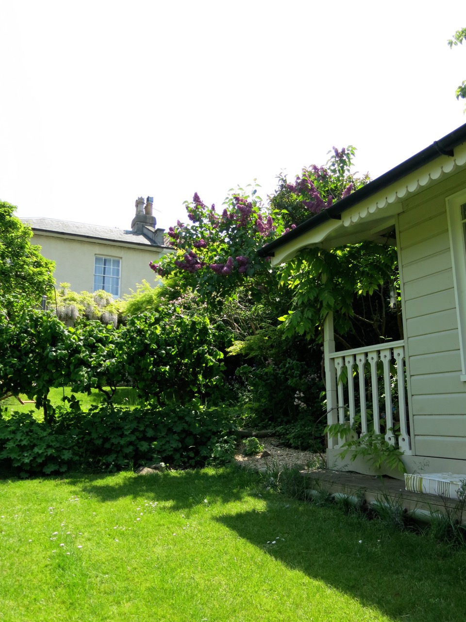
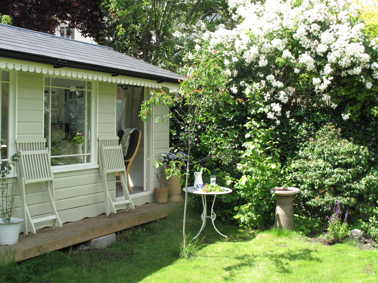
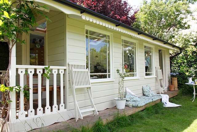
studio build


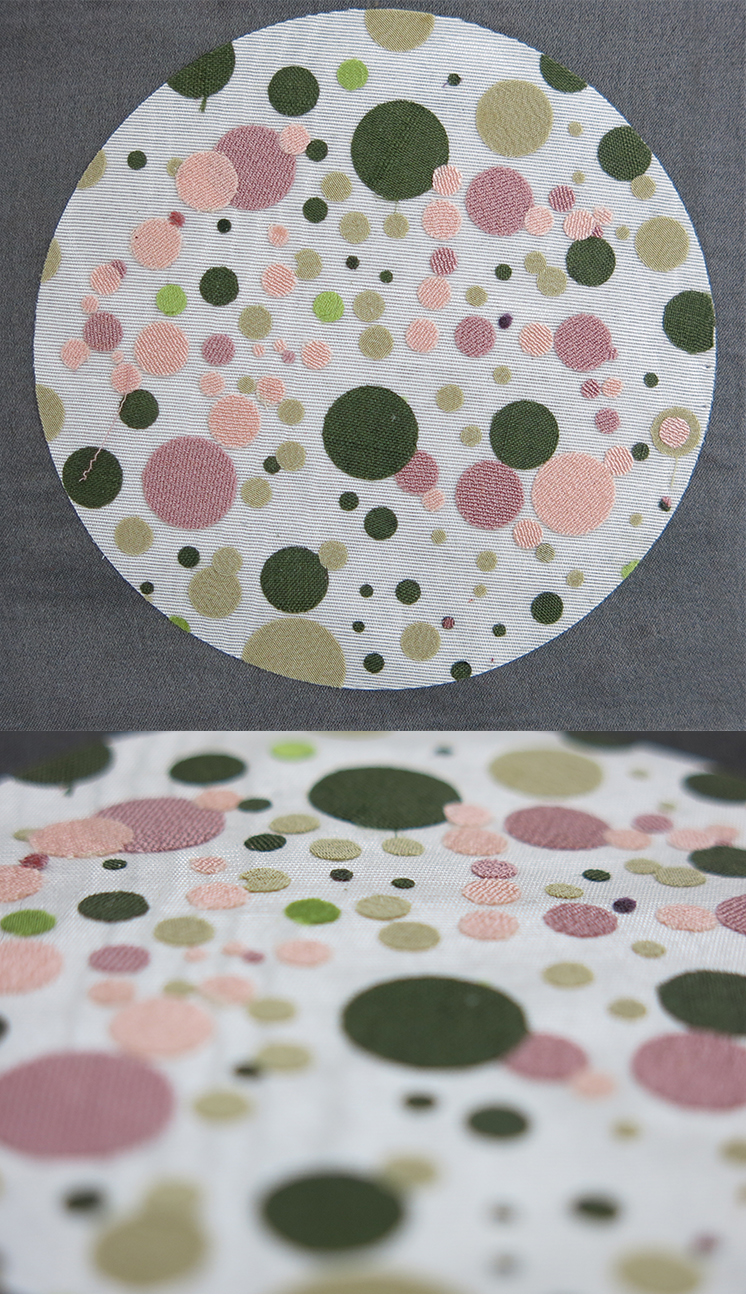
View 2 - kimono silk and silk colour combinations dots

Bamboo forest Arashiyama

Colour mapping : Japan 2017

Japanese rose

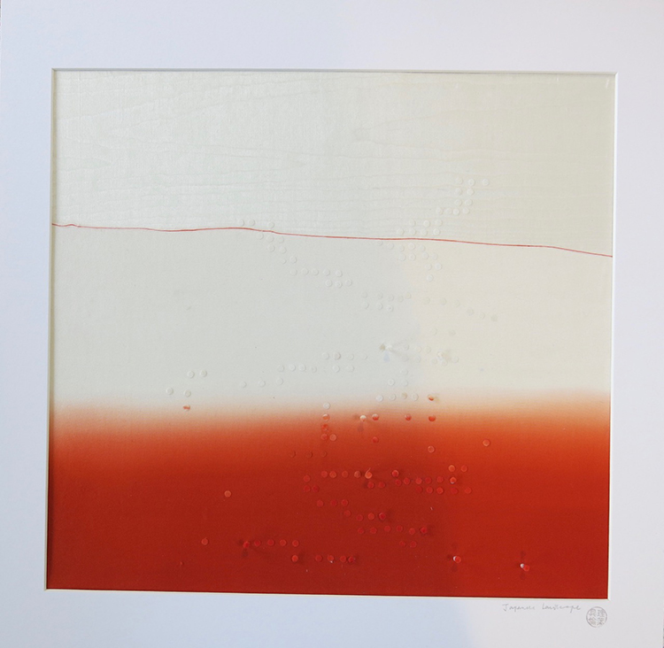
Japanese view
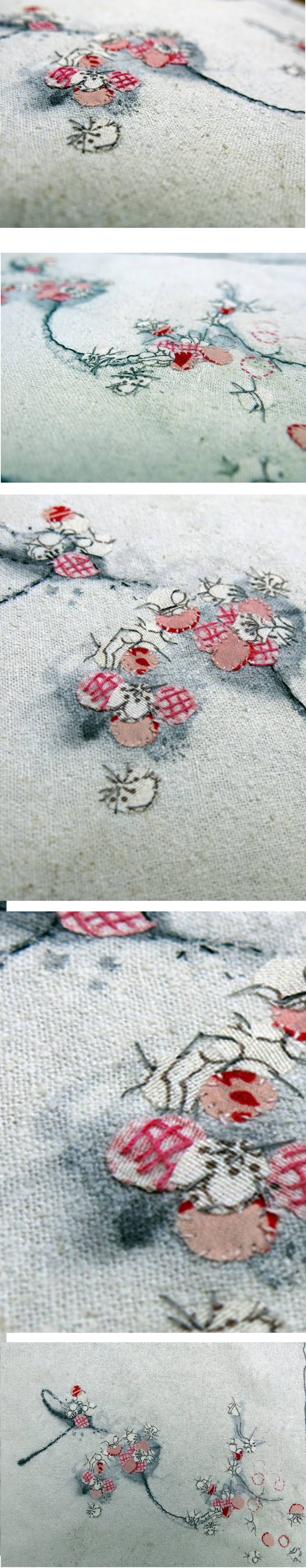
Sakura - cherry blossom
Sulphur mines - Hakone

Tokyo teagarden

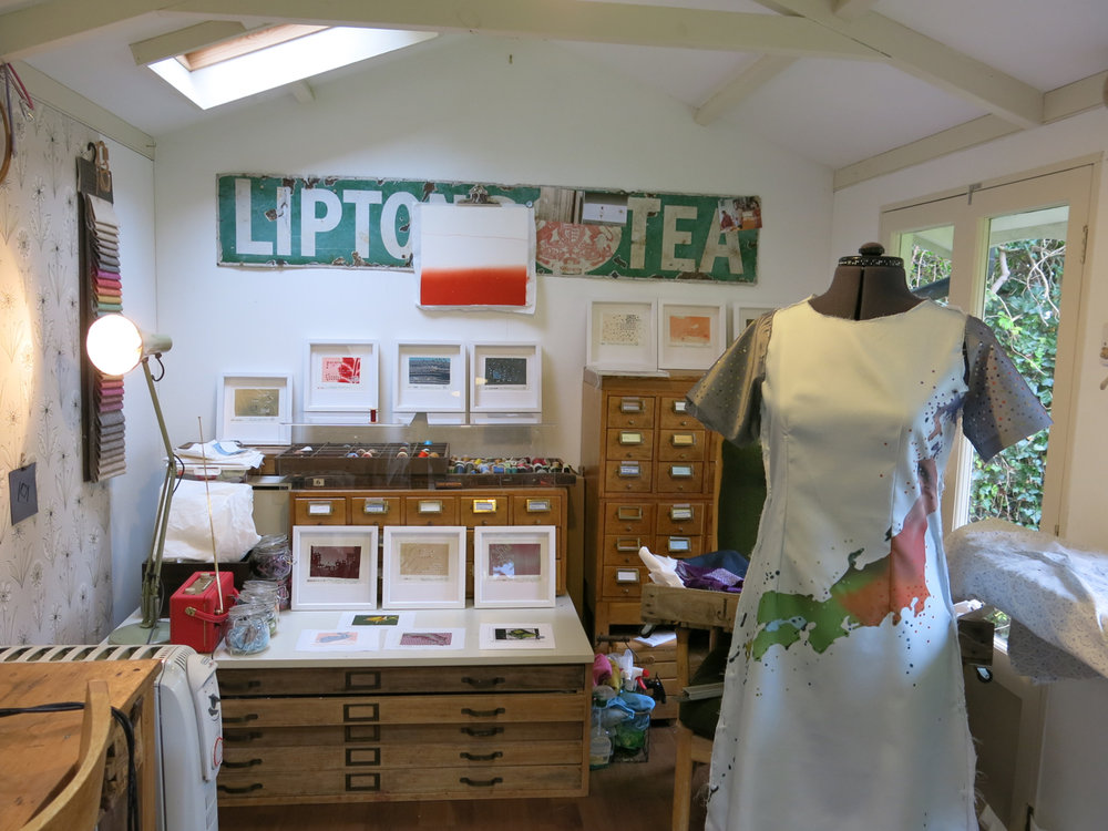
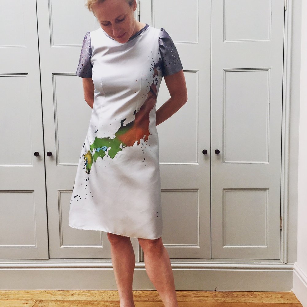
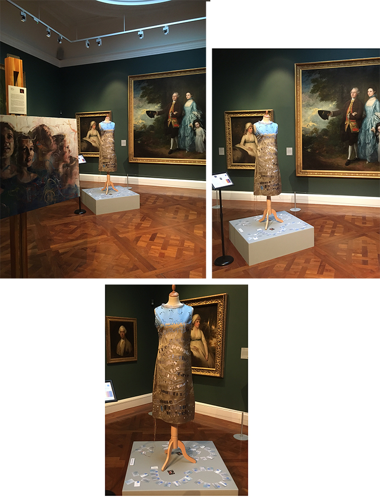
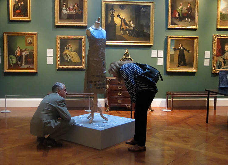
Japanese colour combination art dress
colour mapping :Japan / small pictures 2

colour mapping :Japan / small pictures 1


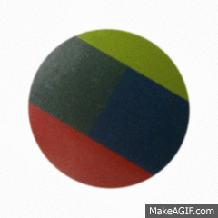
Isochromactic birthday pictures 60,50,30,45
Based on Ishihara's Tests for Colour- Blindness these pictures hope to encourage the recipient to feel philosophical about the numbers associated with ageing.

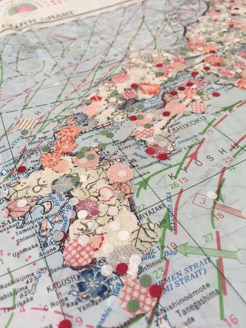
colour mapping :Japan
Colour mapping : Japan
Japan has often been a source of inspiration for my work, from a response to the Japanese tsumani in 2011 to the cherry blossom motif of “A Few Words”, a piece commissioned by Southmead Hospital to raise awareness of organ donation.
I have travelled to Japan a couple of times, but an extended visit in 2016 provided the inspiration for this body of work. It reinforced the contradictions that lie at the heart of my fascination with Japan: the respect for tradition but relentless drive for modernity; the calm order and aesthetic purity matched with a dynamic urbanity and constant renewal.
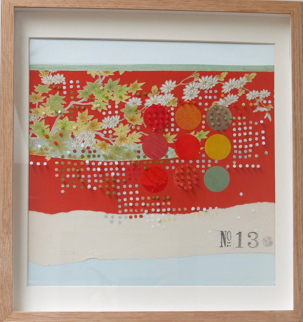
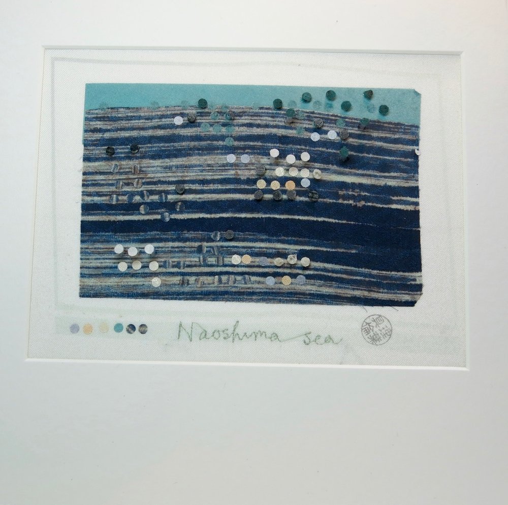
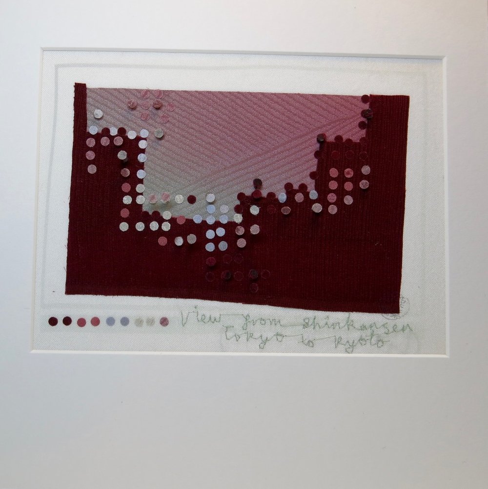
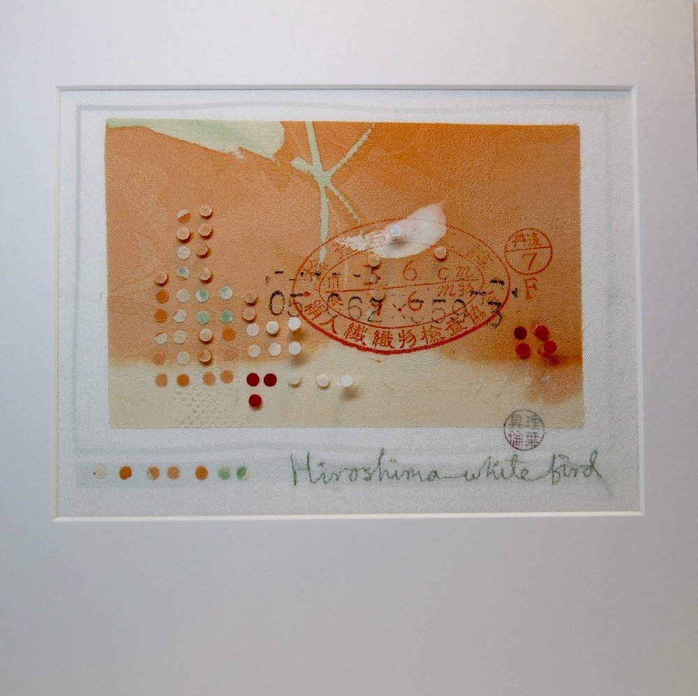
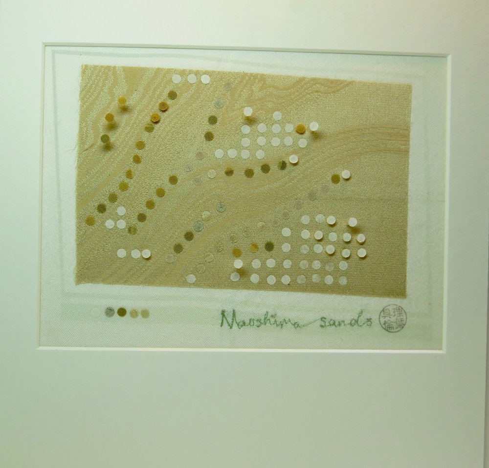
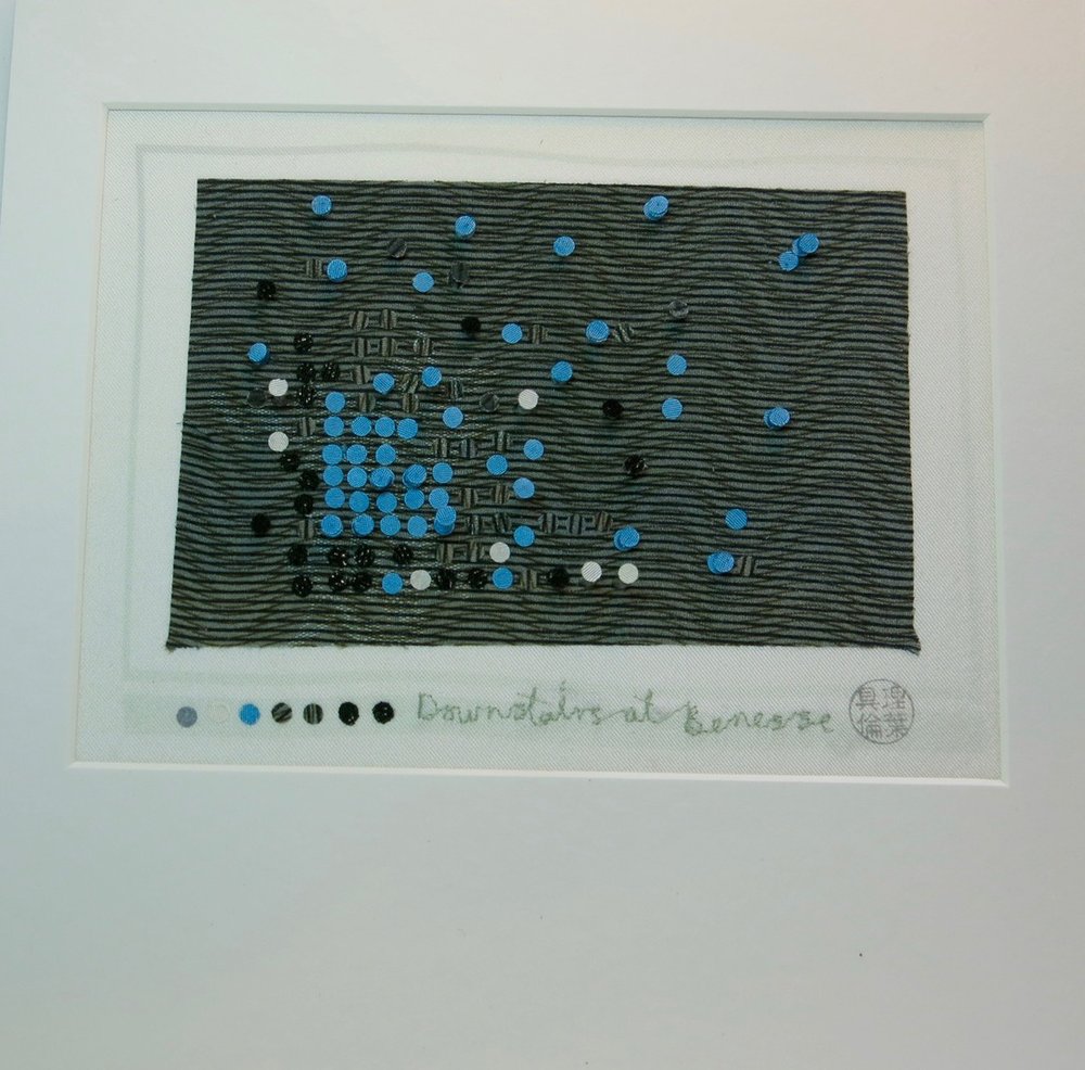
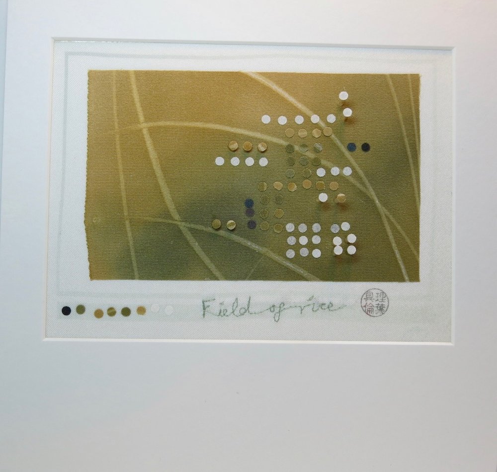
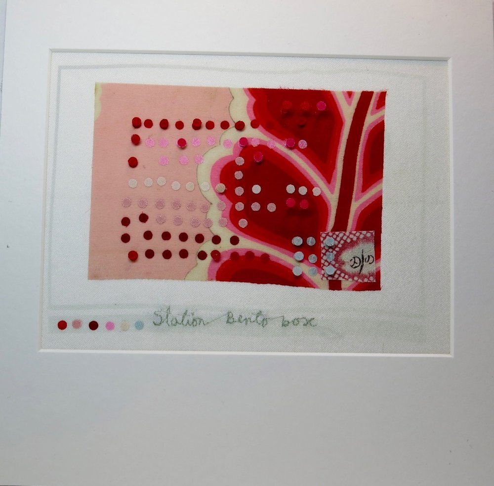
Inspired by the purchase of A Dictionary of Colour Combinations by Haishoku Soukan 1933-1934, the work comprises a series of reflections on my experience of Japanese culture which explore familiarity and unfamiliarity, tradition and modernity through the lens of colour combinations; colour driven interpretations of city and country - from the atomic black rain of Hiroshima to the neon overload of Tokyo, from the Golden Temple in Kyoto to Tadao Ando buildings in Naoshima.
Each piece is postcard sized and is made from kimono silks – a representation of a brief moment in time and place. At the foot of each card is a series of colour dots that are the essence of the colour moment and reference colour tests used in fabric printing.
The key to the exhibition is a dress made from a modern Japanese pattern, a piece of clothing symbolising the singularity of Japanese fashion as a combination of past and present; it is both artwork and garment. Printed on the silk is a map of Japan, designed using the traditional paint colours exhibited in the Narukawa Art Museum, Hakone. The map charts the colour journey and links to the locations of the postcards.
The work embodies the exploration of a modern aesthetic through a traditional medium – the craft of fabric and thread. It represents a passion and perspective on the culture of Japan.
The work will be first seen at the West of Bristol Arts Trail from 14-15th October, and then I hope to move it to a venue which celebrates Anglo/ Japanese cultural exchange.


Japanese colour combinations
Leavers Dress at The Holburne
Sakura revisited
A cushion for the edge of the world
